
Universal Khaki & Friends: The Sherwin-Williams 2026 Color of the Year
Every fall, paint lovers wait for the big reveal: Sherwin-Williams’ Color of the Year. For 2026, the spotlight is on Universal Khaki (SW 6150)—a grounded, earthy neutral that balances timelessness with the flexibility to work in almost any style.
But Sherwin-Williams didn’t stop at one shade. This year’s pick is part of a bigger story: the Colormix Forecast 2026: Anthology, Volume Two, which introduces four curated palettes and 48 trending hues. Universal Khaki leads the Foundational Neutrals set, surrounded by a lineup of colors that feel calm, natural, and effortlessly livable.

The Studio Lee Take
We’ve always said neutrals don’t have to be boring—and Universal Khaki proves it. With the right layers of texture, greenery, and personality, this shade anchors a room while leaving plenty of room for bold moments.
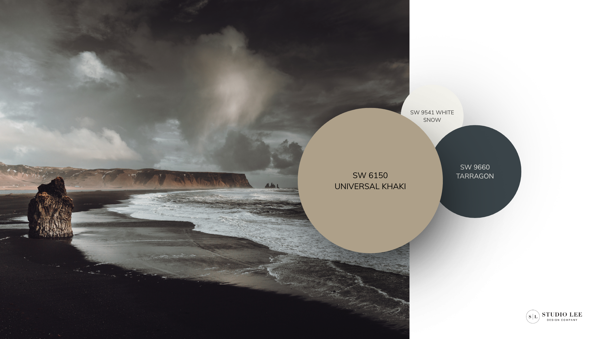
Our current crush? Universal Khaki, Tarragon, and White Snow. Calm, earthy, and grounded—it’s Organic Modern at its best. Sprinkle in Dark Auburn or Henna Shade sparingly, and suddenly the palette goes from safe to striking.
And yes—we know, it’s not all green this time. While we’ll forever love a soft, organic green, these deeper, moodier tones (think Dark Auburn and Henna Shade) bring a cozy, seasonal richness. It’s like swapping your iced latte for a warm mug of coffee when fall rolls in.
Through it all, our design DNA stays the same: nature is the starting point. Universal Khaki feels like river clay under bare feet. Tarragon is that muted green you notice on a late-summer hike. White Snow, Cream and Sugar, and Limestone? They’re the grounding backdrop—like sunlight pulling the whole landscape together.
That’s why we’re loving the 2026 palette. It’s not just paint on the wall—it’s a reminder that good design, like nature itself, is all about balance, layers, and rhythm.
Our POV
Universal Khaki isn’t just another beige—it’s a connector. The kind of shade that makes a whole house feel pulled together without shouting for attention. When paired with Sherwin-Williams’ curated swatches, you get a palette that’s grounded, flexible, and ready for real life.
At Studio Lee, that’s the sweet spot: design that holds up to coffee spills, late-night dinners, and the chaos of everyday living—while still looking intentional and timeless.
Neutral by nature, bold by design.
Stuck on paint colors?
An HourLee Session makes it easy to choose the right shades for your home.