Design Diaries: Mixing Materials, Styles, and Real-Life Priorities
The Stallings Place project didn’t fit one style (and that’s a good thing)
Not every project walks in with a clear aesthetic and honestly, those are usually the ones that turn out the most interesting.
Stallings Place wasn't about chasing a single style or recreating something pulled straight from a mood board. This was a full-scale renovation rooted in real life: how this family cooks, lives, travels, and grows. The result is a layered mix of traditional, transitional, and mid-century influences that somehow just works. The goal was to design something that wasn’t trendy but felt like them.
The Scope: A Full Reset Without Starting Over
This project included a full kitchen gut renovation (keeping the existing layout), two full bathrooms, one powder bath, and a tight, intentional budget. The clients came in with a wide range of influences and no interest in being boxed into one style—inspiration pulled from travels, collected pieces, and years of living in their home. It wasn't one look; it was a blend. And our job was to make all of those ideas feel cohesive without watering them down.
The Challenge: Designing Around Real-Life Priorities
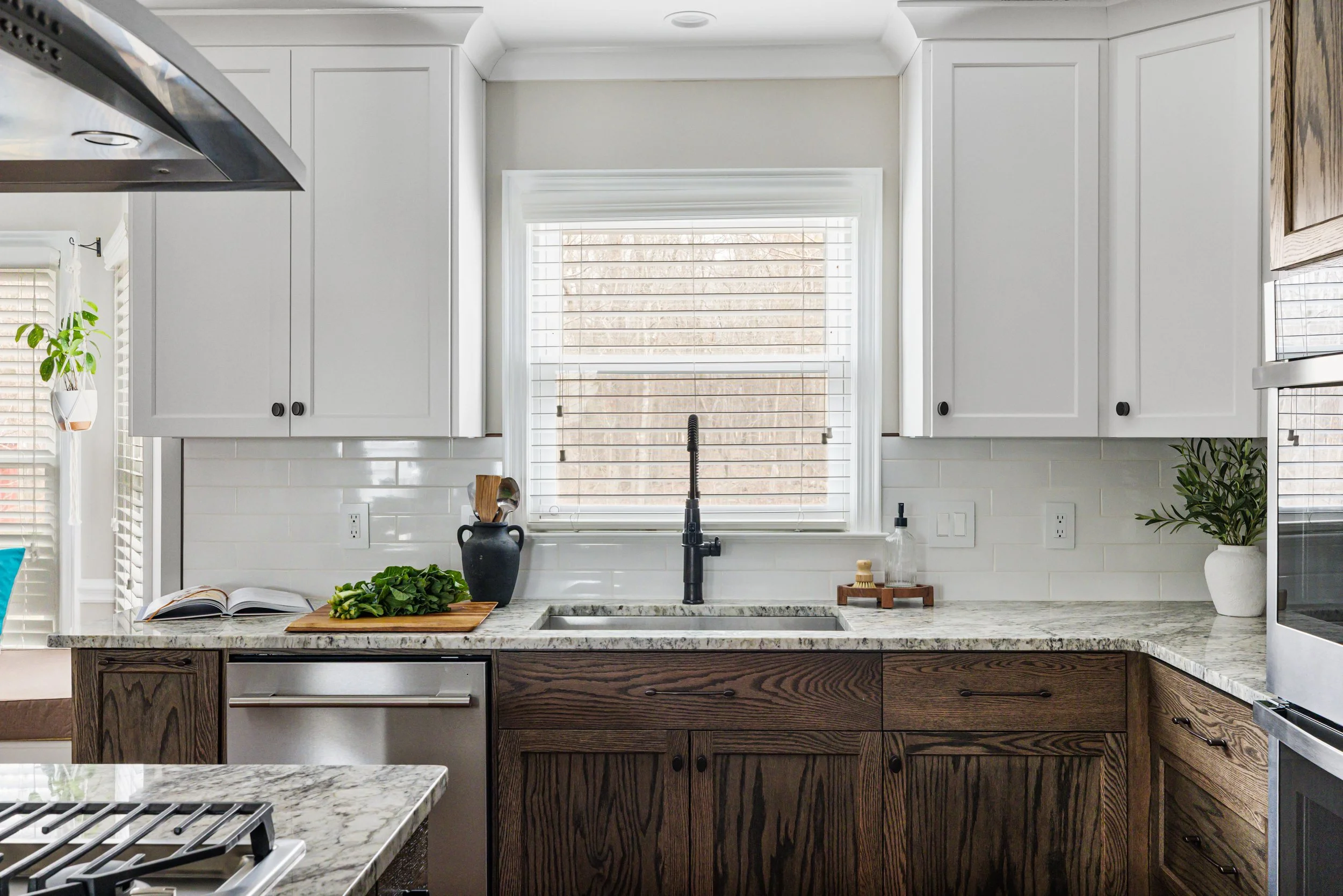
Every project has its non-negotiables, and this one had a few that required some careful thinking: terracotta floors in the kitchen, granite countertops, durability over "perfectly styled," and a home that could flex for both adults and a growing tween.
None of these things is bad, but they do require intention. Terracotta brings a very specific warmth. Granite can be visually active. And mixing styles without a clear lane can go sideways quickly if not handled carefully. But this is also where good design shows up—not in controlling every decision, but in making everything work together anyway.
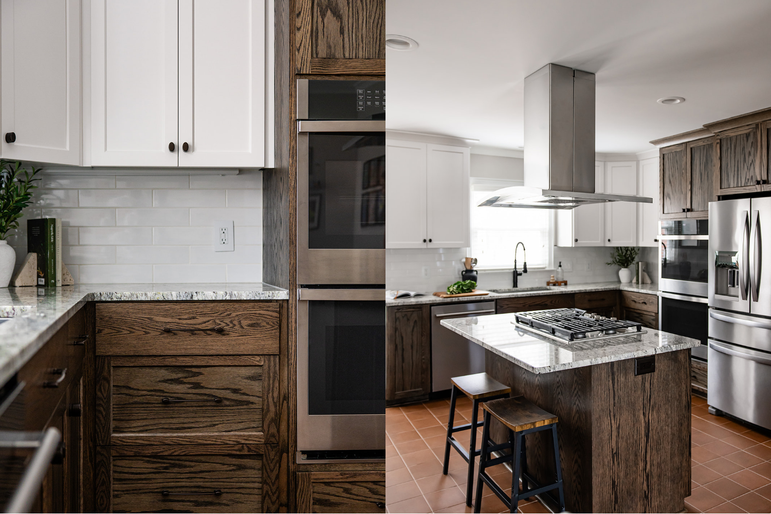
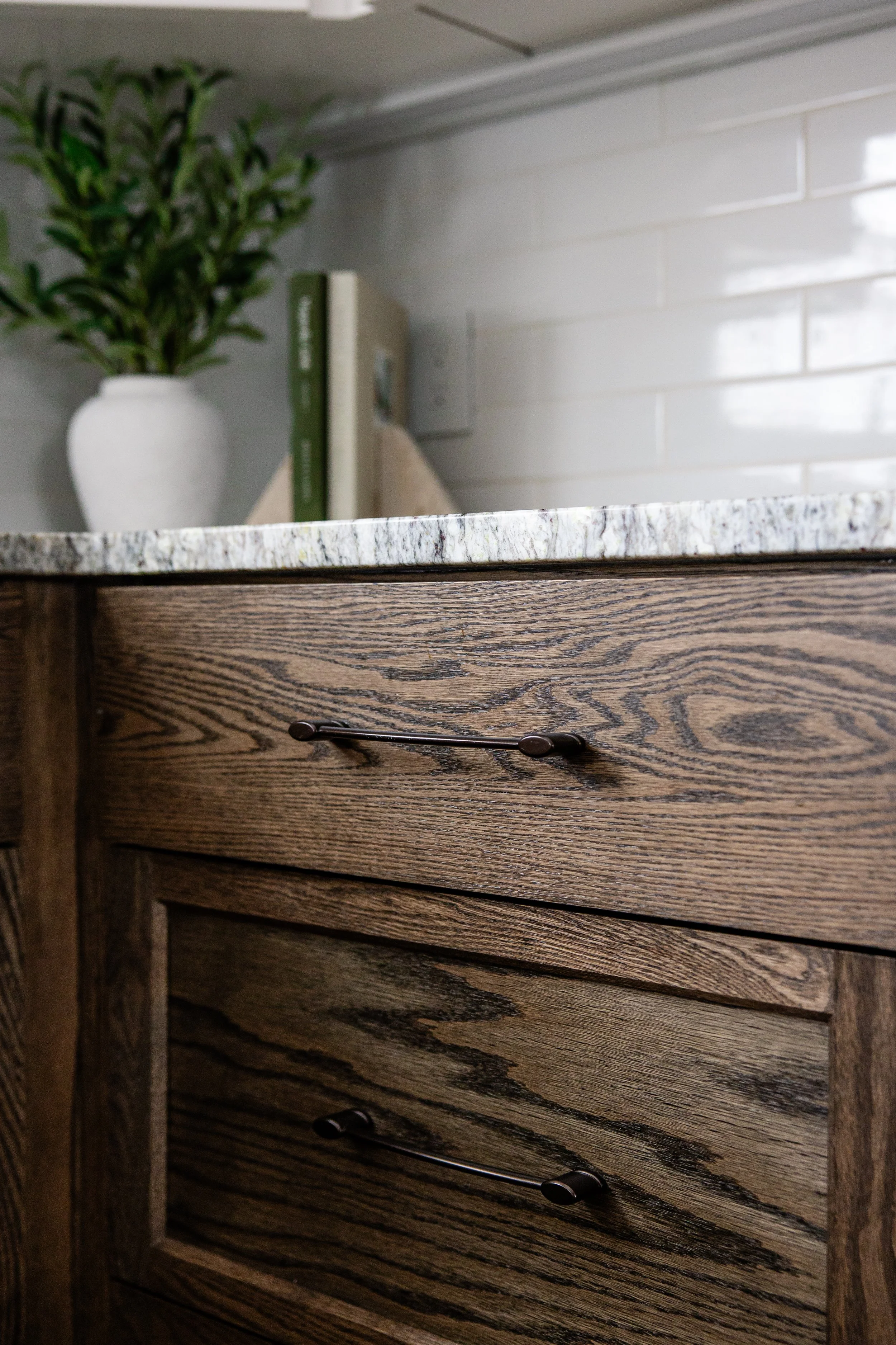
I can’t believe it’s not walnut! Would you believe us if we told you these cabinets are actually dark-stained oak?
The Kitchen: A Balancing Act of Texture and Tone
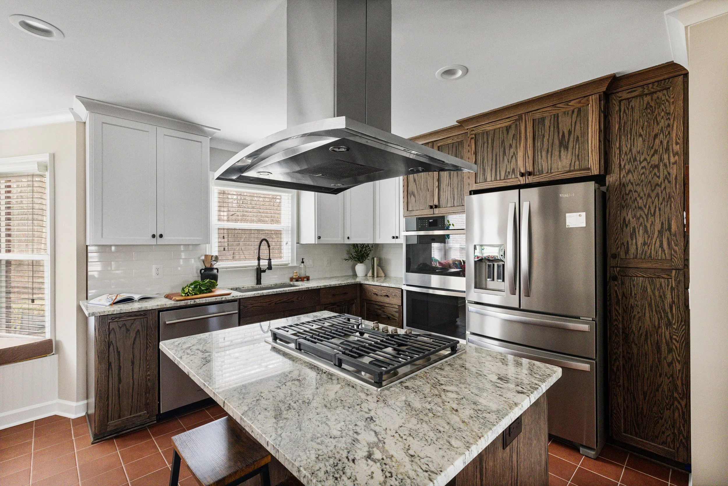
The kitchen became the anchor of the home and easily the most layered space in the project.
Terracotta Floors
This was a first for us, and we'll be honest: we were a little cautious going in. Not because we don't love terracotta, but because it sets the tone immediately. It's warm, grounded, and not exactly subtle. Everything else in the space had to be chosen with that in mind. Instead of fighting it, we let it lead and carried that warmth through the rest of the design in a more controlled, considered way.
Granite Countertops
This was a heavy-cooking household, so durability won here, and rightfully so. Granite tends to be more visually active, with natural speckling and variation that can compete with other elements if you're not careful. So instead of layering more complexity, we simplified everything around it—no competing backsplash, no overly detailed cabinetry. Just clean, intentional pairings that let the granite do its thing without overwhelming the space.
Cabinetry
The clients wanted white oak, but not the version you're seeing everywhere right now. No light, airy finish. No overly warm tone. Instead, we worked with a darker, cooler custom stain that completely shifted the feel of the space. It still reads natural and still brings in texture, but in a way that feels more grounded and a little less expected. To balance the visual weight of the darker lower cabinets, we brought in off-white uppers and kept the backsplash minimal. When your floors, countertops, and cabinetry all have movement, something has to pull back and let the room breathe.
Finishes
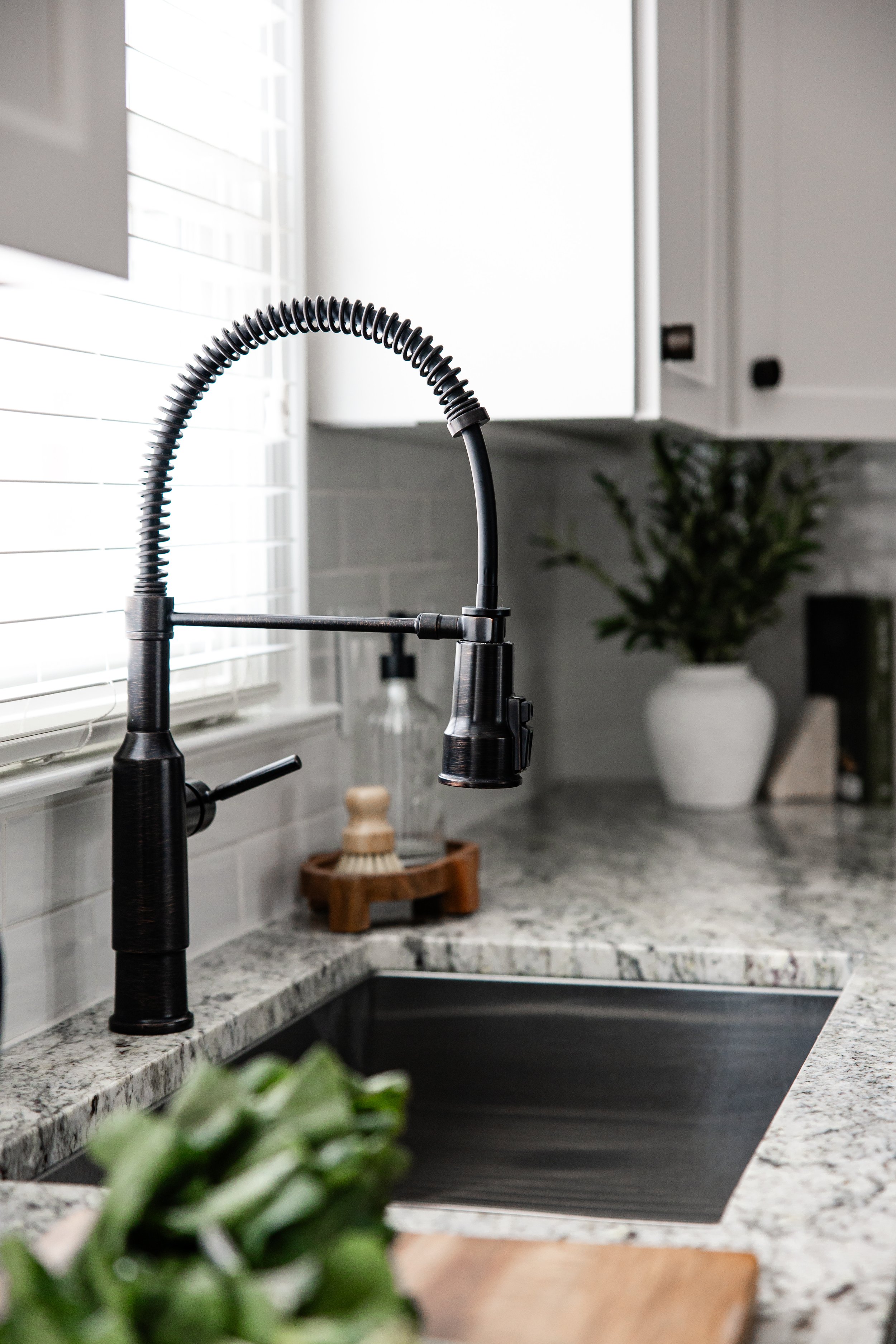
Oil-rubbed bronze carried through the kitchen, adding contrast and depth against the warmer tones of the terracotta and wood. It's a subtle detail, but it's the kind of thing that keeps a space from feeling flat or unresolved.
Oil-rubbed bronze hardware and fixtures make the ideal bridge between warm and cool, traditional and mid-century.
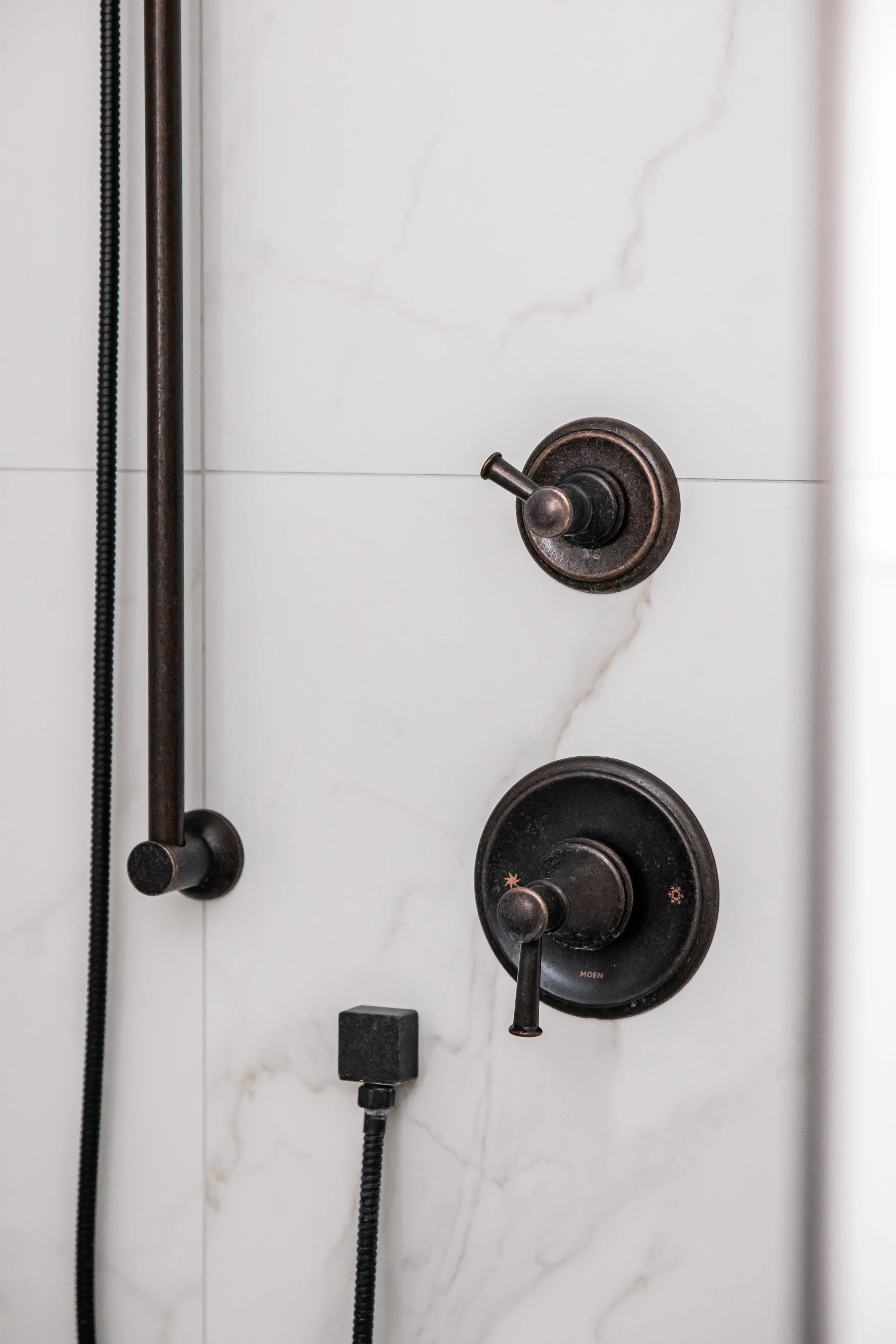
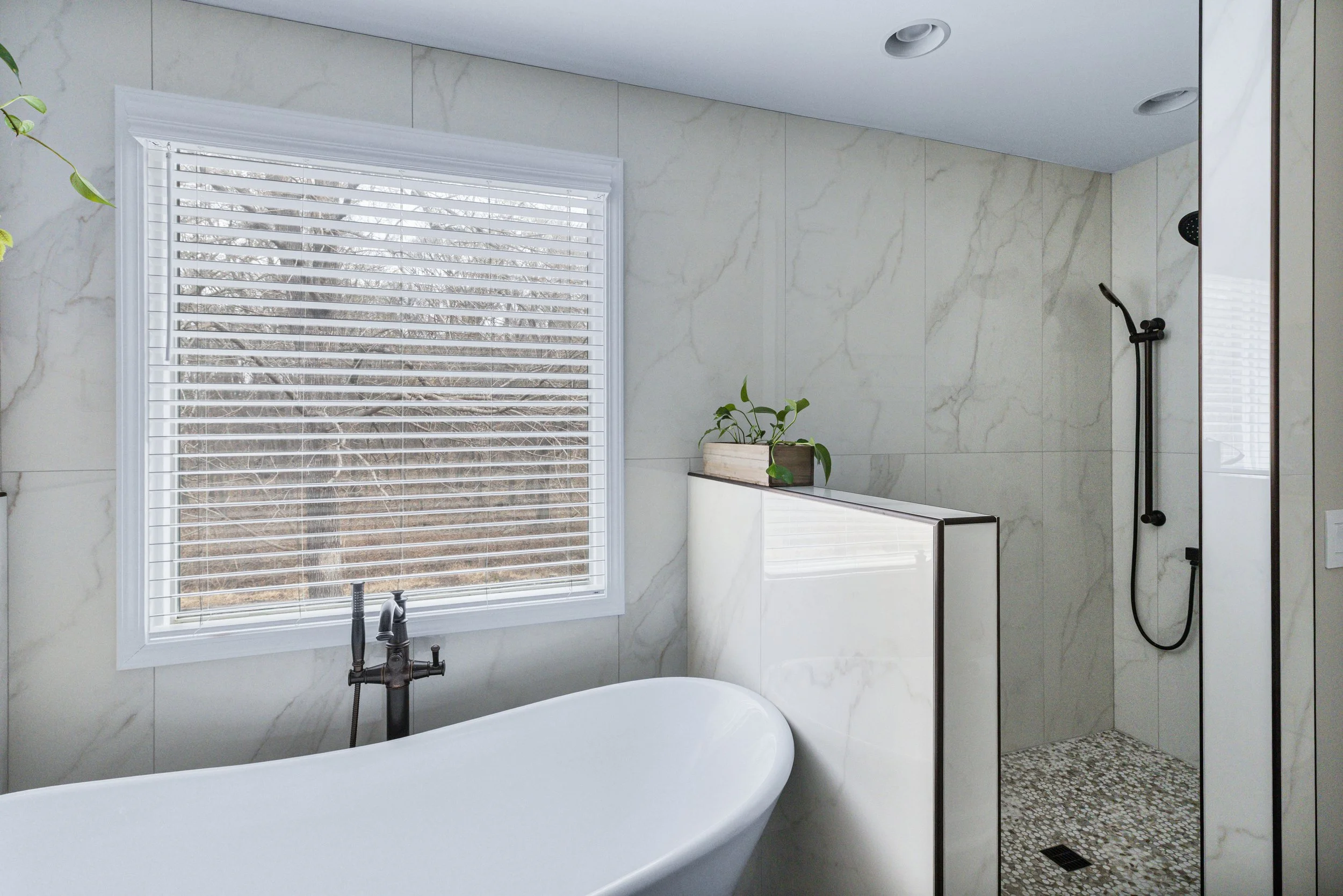
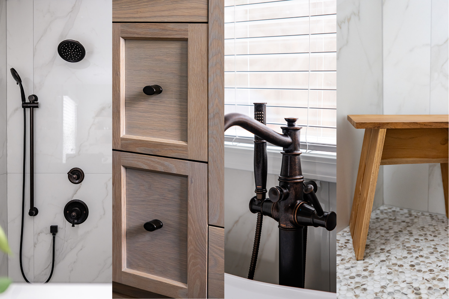
The Bathrooms: Clean, Practical, and Built for Life
Upstairs, the goal shifted slightly. The priority here was light, low-maintenance, and easy to live with, day in and day out.
For both the primary and secondary baths, we chose large-format tile to minimize grout lines (a practical call, especially with hard water), kept the palette in soft whites and off-whites, and introduced white oak cabinetry with a gray-wash finish to cool things down without losing warmth. Slightly darker grout throughout adds longevity, because real life happens. The result feels clean without feeling sterile, and practical without feeling basic.
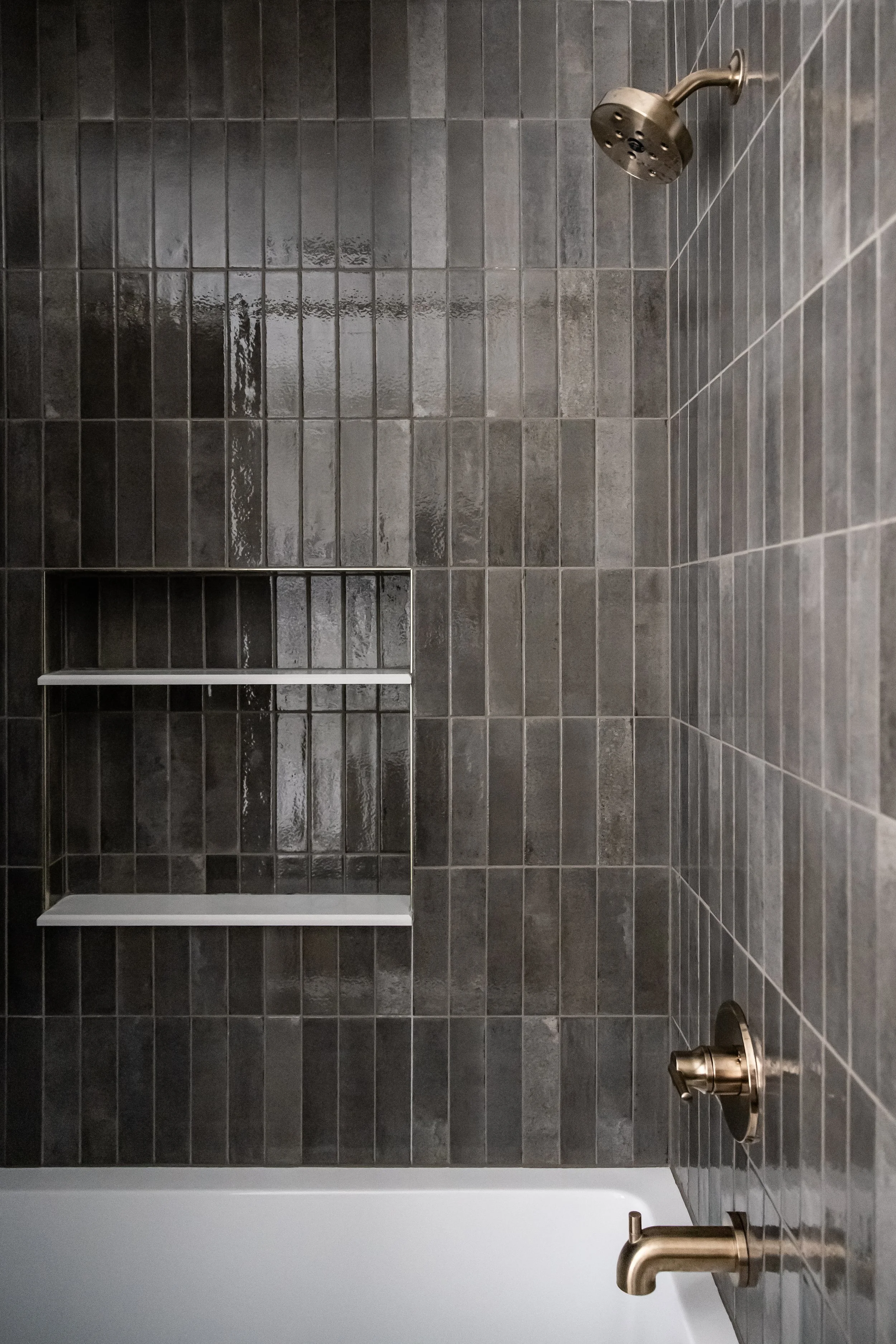
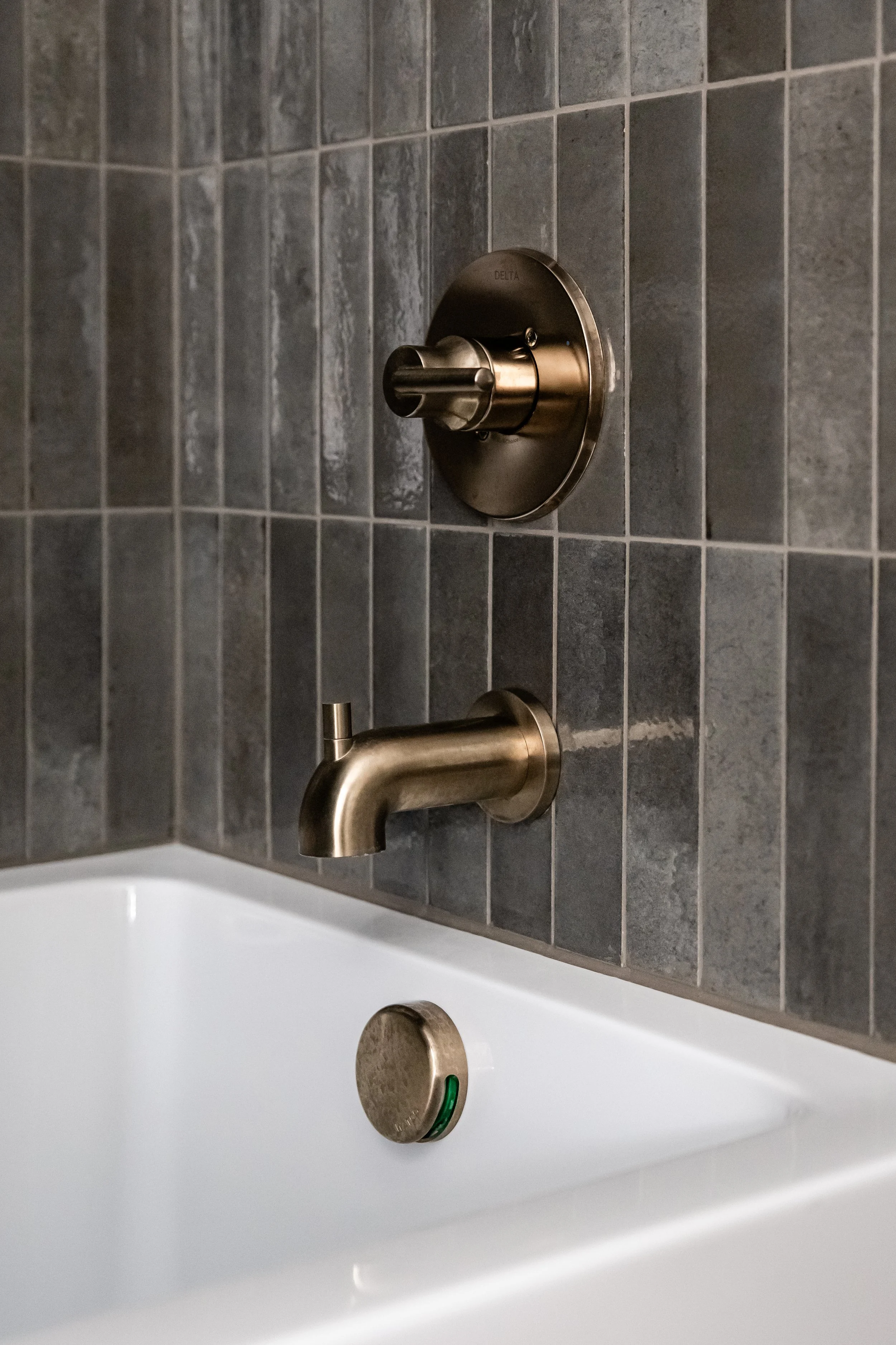
The tween bathroom got a bit more personality. We kept the layout functional with an oversized tub and shower combo, but layered in a vertical stacked tile in a mocha-gray tone and brought in brass globe lighting and a slightly more mid-century feel. It's a space she can grow into rather than out of, which is always the goal when designing for younger clients.
The powder bath was a chance to go all in. Small space, big swing: color-drenched walls in a deep maroon, paired with brass fixtures and warm wood tones. It's moody and unexpected, and it works because the rest of the house gives it room to stand out. Every home deserves at least one space that makes you stop for a second.
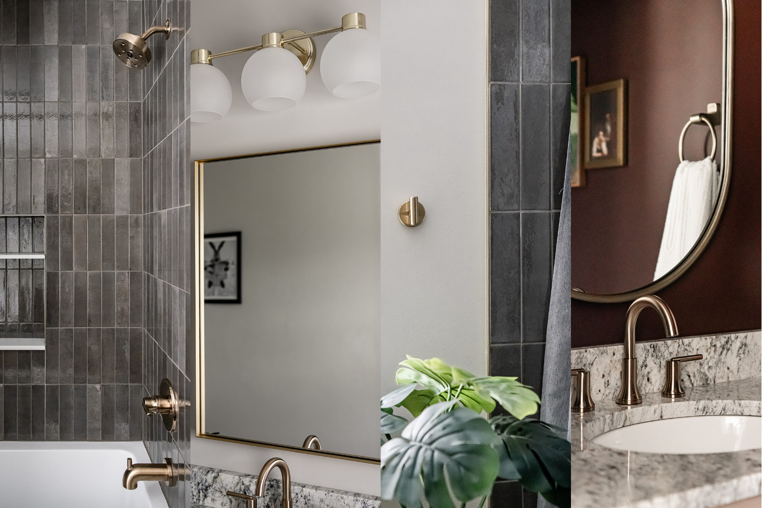
A tween bathroom that won’t need to be updated in 5–10 years? Yes, please!
What This Project Really Came Down To
This one pushed in all the right ways. A tight budget, materials that don't always design themselves, and a mix of styles without a clear label. But that's also what made it worth doing.
Real homes aren't built around perfect samples and trending palettes. They're built around people—how they cook, what they've collected, and how they actually move through their days. Our job isn't to force a look. It's to take all of those pieces and make them feel resolved.
The result is a home that doesn't fit neatly into one category, but feels cohesive anyway. A kitchen that works hard and still looks good. Bathrooms that are calm, practical, and built for real use. And a mix of materials and styles that, on paper, shouldn't work, but do. When design is done right, it doesn't need a label. It just needs to feel right.
Designer: Erica Lee, Owner of Studio Lee
Builder: Quicksilver Custom Builders
Photography: White Wolf Productions
Ready to design a home that feels just right?
Schedule your design consultation and get expert guidance on your specific project.